Tuesday, February 14, 2012

Catching-up Part II

After finishing Wicked, I decided it was time to create a piece that wasn’t a present and would help me refine my skills a bit farther. Since I was still getting my drawing skills back into shape after several years of disuse, I decided to do another reproduction piece. Subjects with a more “cartoony” style seem to work best for paper work, so I turned to one of my favorite poster artists, Eric Tan. Eric has created quite a few posters for Pixar’s feature animation films beginning with The Incredibles, so while you may not know his name, you’ve probably seen his work. His style is heavily influenced by advertising posters of 1920’s – 1940’s and utilizes the strong graphic and geometric elements favored during that period.

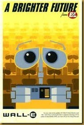
Here’s a little sample of Mr. Tan’s awesome poster work:

    0110_tanincredibles_thumb   tanrat3    wall-e-2  

    The Incredibles (2004)             Ratatouille (2007)                     Wall-E (2008)

 eric_tan3        spy   aurora_poster

            Up (2009)                                 Cars 2 (2011)                 Sleeping Beauty (1959)   

I finally settled on this piece from Ratatouille because it required me to figure out how to do some soft-edged gradient transitions (like the change from deep to middle red in the logo lettering). Plus, it would look good in my kitchen:

                       remyfood1       

                           Eric Tan’s Original           My Tribute: paper  Art Size: 9.5”x 6”

I solved the shading issue by cutting the basic shape of the darker color, using a fairly wide brush to wet the paper on the blending edge and scraping it with the blunt end of the brush. This allowed me to give it a torn, fuzzy effect but with more control than just tearing the paper. I then glued this fuzzy-edged piece to a normal piece of the lighter red.


Please excuse my John-Madden-esque highlighting, but I couldn’t resist.

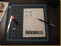
Next, I needed to do a reverse-cut of the lettering on the background sheet so my long strip of gradient paper could show through. This required drawing the Ratatouille logo on the backside of the background sheet backwards. Luckily, I had fairly perfect this technique during the Wicked piece.

IMG_0349

I then carefully cut out all the letters, saving them so I could use the interior pieces for the R, A’s and O. This was fairly difficult since the background paper I used was relatively thin, unlike most of the card stock I tend to use.

       IMG_0351    IMG_0352

Once the lettering was cut-out, I glued the gradient piece to the back of the background Finally, I glued the half-oval, triangles and oval into the R, A’s and O respectively (a procedure which required tweezers and much patience.)

      IMG_0365   

I decided to use the reverse cut technique for the Disney-Pixar portion of the logo and learned it doesn’t work so well with non-blocky lettering smaller than about 1 inch tall. These letters just weren’t as neat and crisp as I would have liked (again, the thinness of the background paper played a part in my difficulties.) Since this project was about learning what works and what doesn’t, I’m not very upset with the final product. I’ll just do it differently next time.

The rest of the piece was pretty standard construction, just layering the different colors. Below, you’ll see how I added Remy’s eye which is made of three separate Layers:


I used the gradient technique again for Remy’s belly (above), ear and nose as well as the “Bon Appetite” along the right side of the rolling pin.

All in all, I think I did good service to the original art  and I’m very happy with the final product. One of these days I get around to matting it and hanging it in the kitchen.

Please tune in next time when we’ll visit The Hatbox Ghost at Disneyland’s The Haunted Mansion.

Saturday, February 11, 2012

Catching-up

I decided it was finally time to carve out a little corner of Web to display my cut-paper work for more than my family and Facebook friends – especially since I would like to start selling some pieces. So, here is catch-up of what I’ve been up to over the past two years:

When my niece Madelynn was born in February 2010, I decided to forgo the standard cute baby outfit or stuffed animal, instead making something a bit more personal. I’d been toying with the idea of layered paper for a while and this seemed the perfect situation to use the technique. The resulting piece, based on the Dr. Seuss classic Horton Hatches the Egg, showed her full name and birth date floating on clouds above the Jungle Nool where a pair of Horton-styled elephants stared proudly at a just-hatched, pink elephant-bird. Unfortunately, I either neglected to take any pictures since I was trying to get it in the mail or the pictures are hiding in some sub-subfolder on my hard drive.

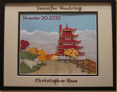
In late November in 2010, my cousin Jenn and her husband Chris finally decided to take life’s big plunge and get married. Being an eclectic couple, they decided on an outdoor, twilight ceremony at the Pagoda in Reading, PA. This seemed another good opportunity to stretch my creative muscles and push my paper skills farther.

After searching the web, I managed to find this postcard of the Pagoda from 1915 and thought it would be the perfect basis for a piece:

pagoda postcard 1

You’ll notice I changed the season to Fall in the final piece to reflect their date choice.

IMG_0123Pagoda Wedding: Paper, oil pastel and stamp ink. Art size 8x10, Matted/Framed 11x14

Art projects and such fell by the wayside during the busy 2010 holiday season (especially since I have two small children), and I really didn’t get a chance to get back to work until my mom’s birthday in March 2011. My mom is a HUGE Wizard of Oz fan, particularly the Wicked Witch of the West. She saw Wicked on Broadway and loved it so much, she took me, my wife and my older daughter to see it a second time. The original Playbill art is perfect for a cut-paper illustration:

wicked-playbill

Which made my choice pretty much a no-brainer.

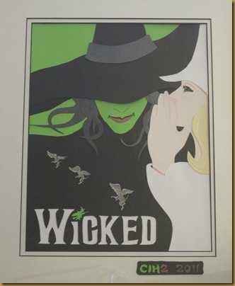
Wicked: Paper and art marker, Art size: 11x14, Matted/Framed: 16x20

My cut-paper version is very close to the original design with only some slight modifications:

  • Using a shinny black/charcoal paper for Elphaba’s hat band and hair so it would stand out a bit from the matte black of the dress and hat.
  • Separating the Elphaba’s hair into snake-like locks which I then layered and wove for a more interesting texture.
  • Adding highlights to Glinda’s hair

To achieve an incised dimensional look, I reverse-cut the WICKED logo lettering from Elphaba’s dress and then backed it with a textured white paper. 

Although it is difficult to see in the above photo, the Flying Monkeys are actually made from three pieces (two wings and a body) of gray paper which I then detailed with a darker gray marker. 

So this takes us through March of 2011. Please tune in next time for my tribute to Pixar’s Ratatouille.