Paper Worlds
The cut-paper art of Ike Horton
Tuesday, September 22, 2015
Tuesday, January 27, 2015
Book Review: ROUGH DRAFT by Mike Yamada and Victoria Ying
 Mike Yamada and his wife Victoria Ying have pretty impressive animation credits for a couple of young artists: He’s worked on Puss in Boots, Kung Fu Panda 2, How to Train Your Dragon, Flushed Away, Monsters vs. Aliens as well as a bunch of live-action films and she’s worked at Disney Animation on Tangled, Paperman, Wreck it Ralph and Frozen. So, when they write a book about Visual Development, it’s time to pay attention.
2011-2013 rough Draft: The Collected Art Demos of Mike Yamada and Victoria Ying ($20+shipping for the paperback version or $15 for the ebook) is a slim volume of only 46 pages that gives a great introduction to the field of Visual Development (Vis Dev in industry slang.) The book is split into two parts: Part One – Ideas and Part Two – Case Studies.
 Part one gives a brief introduction to the world of Vis Dev including the many roles the Visual Development Artist plays in the early stages of an animated film, helping to create the “look” of the the film. There are sections of research, how to match the lighting of your world to the needs of the story, and a step by step look at their painting process.
Part Two follows the Vis Dev process from start to finish through three case studies taken from classes Yamada and Ying taught at the Concept Design Academy in Pasadena, California: Snow White set in Feudal Japan, Pinocchio set in Tibet and Peter Pan set in the
 South Seas. Seeing how the pair worked through each of their concepts, changed the design and developed the color scripts for the projects is really an eye opening experience and could be helpful to traditional artists as well as animators. I found the color scripting sections the most interesting, how the changing dominant colors in the sequences followed the progression of the story as well as how certain colors become identified with different characters. Although I'm not an animator, aspects this concept seems to be applicable to any sort of of illustration work, especially if you are working on multiple pieces to illustrate a book or story (I just ran across this same concept in James Gurney's (Dinotopia) painting book Imaginative Realism. ) After reading and studying Ying's and Yamada's work, I definitely have a better feel for how to relate the colors associated with certain characters in my work with the appropriate feelings I want to evoke. And there is so much more: how to develop props and do set dressing, creating characters who seem live in the same world, and how incorporate parts of your reference pictures so that your work feels genuine without being a slave copy of the original.
If you are interested in animation and Vis Dev in particular, Rough Draft is great little book well worth the price (hey, the book is self-published so you are supporting some awesome artists.) For more of Yamada’s and Ying’s work, check out their blog site Extracurricular Activities – they update regularly with tips, product reviews and thoughts on being an artist.
If you are interested in further reading about Visual Development/ Production Design, check out Hans Bacher’s Dream Worlds: Production Design for Animation (2007) which I will review in a future post.
Thursday, January 22, 2015
“Got My Eye on You”

Art Size: 9 1/2" x 9 1/4" ( 11 1/2" x 11 1/2" matted)
Frame size: 12 3/4" x 12 3/4"
I have to admit that I didn’t see Monsters, Inc. when it was originally released back in 2001. That was pretty busy year for my wife and me: we bought a house and then spent months doing extensive renovations before we were married in October. Also, our Disney obsession hadn’t kicked in yet. I’ve always been a fan of Disney Animation and I loved the first two Toy Story films from Pixar, but it wasn’t our older daughter was old enough to really enjoy the Disney magic that our true obsession manifested. I have seen Monsters, Inc. on video numerous times since then (it’s now among my favorite animated films) and made sure to see the 3D conversion in the theater the other year.
It’s really is no surprise that Mike Wazowski has been my favorite character, as well as one of my favorite Disney characters period, since I first saw the film. I’ve been a fan of Billy Crystal’s smart-alecky style of comedy for years. He’s note perfect in films like When Harry Met Sally, City Slickers and even his bit part in The Princess Bride. In Monster's, Inc, Crystal played Mike as the embodiment of the everyman nerd, a perfect balance of joie de vie, chutzpah and sarcasm. The relationship between Mike and Sully (John Goodman) is the closest to the old Vaudeville acts of Abbot & Costello or Laurel & Hardy we are likely to see.
I created this illustration around the time that Monster’s University was released in the Summer of 2013. While Mike’s overall design is a simple ball with arms, legs and an eye, there is actually a bit more nuance to him as he appears in the film. I created the interior of his mouth from several layers of paper and then added detail with Sepia Pigma Micron drawing pen and a tan Copic brush marker on his teeth (I used the same technique on his horns.) I also used watercolor paint for shadow areas (the first time for this) and scored/bent the paper around his mouth and on his eyelid to give a more three-dimensional look.
Tuesday, January 20, 2015
For the First time in forever…
Now, that we’re over half-way through January 2015, it seems like a good time to recap what I did in 2014. I didn’t accomplish everything I’d planned in my January 2014 post, but I did manage quite a bit. I created 13 new works, by far my greatest output so far, participated in a local arts & crafts fair and sold eight pieces (included in that total were three commission pieces – two for family/friends and one for someone who saw my work at the craft fair.) I also submitted my piece “The Hatbox Ghost” (coming a future post) for consideration in a group show, but, unfortunately, wasn’t chosen.
2015 looks to be an exciting year. I’m currently working on another commission piece that will grace the walls the soon-to-open “Game Tavern” – my good friends Raithe and Barry have been renovating half their basement into a 
Skill building is actually a lot of what the first part of this year will be about. Besides painting, I’m also working on my drawing skills so that when my younger daughter starts Kindergarten in the Fall, I can really start seriously producing pieces. Look for posts about my progress along the way as well as reviews of the books I’m using – I’m currently working my way through Andrew Loomis’ Drawing the Head and Hands, a 1956 classic that inspired many modern illustrators (including the phenomenal Alex Ross) and has only come back into print in the last few years. Beyond that, I’ve also recently reorganized a spare room into a studio space so that I will no longer have to work at the dining room table – a big relief for our whole family.
Over the next few weeks I will post pictures of my 2014 work ( as well as some older pieces I never posted) and some reviews and later this Spring possibly even a tutorial so you can see how I work. Happy 2015!
Sunday, February 16, 2014
Deadly Sweet
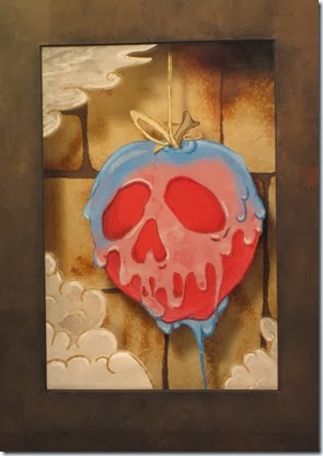
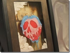
Of course in Snow White, the Evil Queen isn’t just your garden-variety wicked stepmother like Lady Tremaine in Cinderella. No, she’s a super powerful sorceress with an all-seeing Enchanted Mirror and a laboratory filled with ancient tomes of horrid spells and insidious magical paraphernalia. You can tell the Disney Animators (the famed Nine Old Men) had a great time working on the Evil Queen; her scenes are full of the most electrifying drama in the entire film.
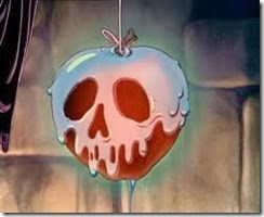
The scene where she retreats to her dungeon lair after finding the Huntsman has duped her and transforms herself into an ugly old crone before finally creating the poisoned apple has always been my favorite of the film (I’m a sucker for bad guys and dungeon lairs.) But my favorite part of this great scene occurs when the Queen/Crone pulls the apple from the roiling vats of poisonous potion. As the apple hangs above the cauldron, potion runs off and clearly becomes a leering skull before returning to a gorgeous red apple.
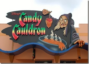
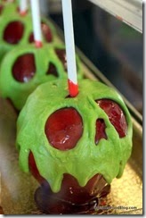
I know I’m not the only one who loves this gag (as the animators would call it.) You need only run an image search on the internet and you find page upon page of of arts, crafts, cakes, shirts and even tattoos using this design. If you visit Walt Disney World’s Downtown Disney, you can get an actual candy poison apple made at The Candy Cauldron (at least around the Halloween season.)
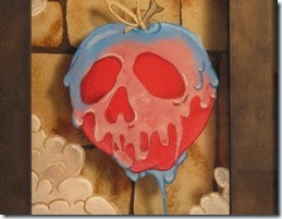
Most of the modern depictions of the apple-with-skull show the skull as a bright green color reminiscent of Maleficent’s skin tone – like the apples above. When I created Deadly Sweet, I decided to go with more screen accurate blue-to-whitish liquid. I achieved this effect by starting with a piece of partially transparent white vellum and lightly coloring with blue Prismacolor pencil which I could then blend out. I also used Clear Plastic Nonglas as a substrate for the bubbling steam and the allow the apple to appear suspended in air. I think these techniques worked quite well to achieve the look from the film.
Additional images:
Deadly Sweet is currently for sale in my Etsy Shop for $45
Wednesday, January 15, 2014
“The Best and Worst Sign You’ll see at Walt Disney World.”
I’d like to use this blog not only as a showcase of my new works, but also a place to give a peek-behind-the-curtain of my projects. I’d like to post not only how I made the pieces ( I’m a total process nerd) but also the “Why.” I believe you can gain a lot of insight about a work from why an artist choose a certain subject. Think of this as the Bonus Features on a DVD.
To kick off 2014, here is a piece I finished just last week titled, “The Best and Worst Sign You’ll see at Walt Disney World.”


“Uh… What’s with the bus stop sign?” I’ll admit that it seems like an odd choice, but this bus stop sign has two things I love: wonderful, nostalgic design and it’s the signal that I’m at Walt Disney World, that my vacation has really begun.
The impetus for this project came in August as my excitement grew over our impending November 2013 trip to Walt Disney World. It’s no secret that my family are Disney Fanatics or more correctly: Disney Obsessed. We’re THOSE people. The ones other people shake their heads and wonder about. Our particular obsession? Disney Parks. Make the mistake of mentioning Magic Kingdom and you’ll be in for an afternoon-long, for-Pete’s-sake-please-let-me-escape discussion of park history, tips and other minutiae. We own and frequently listen to Disney Park Music (I’m currently listen to the Magic Kingdom Entrance loop.) We know the names of Imagineers and can point out their contributions to particular attractions. We delight in finding Hidden Mickeys (my older daughter Katie recently found one in an episode of Dr. Who.) In short, we love the special brand of magic and attention to detail the Disney Cast Members bring to every aspect of your vacation.
For any Disney Resort Guest flying into Orlando International, Disney’s Magical Express is the first experience with this all-encompassing magic.
 Just follow the signs through the airport, past all the poor non-resort schlubbs awaiting their luggage, and you will find yourself
  greeted by friendly cast members who will direct you to the huge, Streamline-Modern-themed motor coaches complete with bathrooms, Air conditioning and video screens full of the awesomeness you’ll soon witness. Wait a minute! What about your luggage? Once you drop your luggage off at your home airport, you don’t need to worry about it until you head home. By Disney magic, it will appear in your hotel room within three hours. All you need do is sit back and relax during the half-hour trip to your resort. Of course, you’re heading DISNEY WORLD so who can relax?
 “Okay, that why it’s the best sign, so why is it the worst?” Easy enough answer – the next time you see that same Magical Express sign is when you are sitting on a bench waiting to be taken back to the airport at the end of your trip. Seriously, there are very few things sadder than leaving Disney World. Katie was sobbing almost uncontrollably as we waited.
 Our bus arriving to take us to the airport.
Here are a couple of additional pictures I used for reference:


"The Best and Worst Sign You'll See at Walt Disney World"
Tuesday, February 14, 2012
Catching-up Part II
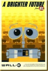
After finishing Wicked, I decided it was time to create a piece that wasn’t a present and would help me refine my skills a bit farther. Since I was still getting my drawing skills back into shape after several years of disuse, I decided to do another reproduction piece. Subjects with a more “cartoony” style seem to work best for paper work, so I turned to one of my favorite poster artists, Eric Tan. Eric has created quite a few posters for Pixar’s feature animation films beginning with The Incredibles, so while you may not know his name, you’ve probably seen his work. His style is heavily influenced by advertising posters of 1920’s – 1940’s and utilizes the strong graphic and geometric elements favored during that period.
Here’s a little sample of Mr. Tan’s awesome poster work:
The Incredibles (2004) Ratatouille (2007) Wall-E (2008)
Up (2009) Cars 2 (2011) Sleeping Beauty (1959)
I finally settled on this piece from Ratatouille because it required me to figure out how to do some soft-edged gradient transitions (like the change from deep to middle red in the logo lettering). Plus, it would look good in my kitchen:
Eric Tan’s Original My Tribute: paper Art Size: 9.5”x 6”
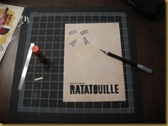
I solved the shading issue by cutting the basic shape of the darker color, using a fairly wide brush to wet the paper on the blending edge and scraping it with the blunt end of the brush. This allowed me to give it a torn, fuzzy effect but with more control than just tearing the paper. I then glued this fuzzy-edged piece to a normal piece of the lighter red.
Please excuse my John-Madden-esque highlighting, but I couldn’t resist.
Next, I needed to do a reverse-cut of the lettering on the background sheet so my long strip of gradient paper could show through. This required drawing the Ratatouille logo on the backside of the background sheet backwards. Luckily, I had fairly perfect this technique during the Wicked piece.
I then carefully cut out all the letters, saving them so I could use the interior pieces for the R, A’s and O. This was fairly difficult since the background paper I used was relatively thin, unlike most of the card stock I tend to use.
Once the lettering was cut-out, I glued the gradient piece to the back of the background Finally, I glued the half-oval, triangles and oval into the R, A’s and O respectively (a procedure which required tweezers and much patience.)
I decided to use the reverse cut technique for the Disney-Pixar portion of the logo and learned it doesn’t work so well with non-blocky lettering smaller than about 1 inch tall. These letters just weren’t as neat and crisp as I would have liked (again, the thinness of the background paper played a part in my difficulties.) Since this project was about learning what works and what doesn’t, I’m not very upset with the final product. I’ll just do it differently next time.
The rest of the piece was pretty standard construction, just layering the different colors. Below, you’ll see how I added Remy’s eye which is made of three separate Layers:
I used the gradient technique again for Remy’s belly (above), ear and nose as well as the “Bon Appetite” along the right side of the rolling pin.
All in all, I think I did good service to the original art and I’m very happy with the final product. One of these days I get around to matting it and hanging it in the kitchen.
Please tune in next time when we’ll visit The Hatbox Ghost at Disneyland’s The Haunted Mansion.


